By Navjoy
In addition to being four times faster during field collection, app-based data collection positively impacts every aspect of data storage and usage. Below are the lifecycle steps of data and what each looks like using a manual method versus an app.
Field data collection
Manual: Technician uses a paper and pencil to record data and notes from the field. These notes include approximate location and asset conditions/problems. Depending on the technician, and the day, these notes could vary significantly.
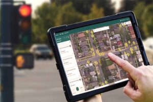
App: Technicians are sent into the field with a mobile phone or tablet. Technicians enter data and notes into the app based on preset details. For example, the app would prompt for condition and the options would be consistent (good, fair, or poor, etc.). The exact location could be pinpointed from in-app GPS records. Images of the asset would also be taken for records and labeled through the app.
Entering and storing data
Manual: The notes would be typed as is into a spreadsheet or a legacy storage system. To locate data on a particular asset, the user must have access to the spreadsheet or legacy system and would have to search based on possible identifying terms or would have to read through to find the data they are seeking.
App: The data is automatically stored and tied to a geographical location on a Google Map. To locate it, simply log into the app and click on the asset.

Manual: This is almost impossible to do because the notes are hand-written, unstandardized, and completely qualitative. It would have to be re-sorted to be standardized and used in a graph format, and even then, each graph’s data would have to be manually sorted through for consistency.
App: The dashboard has automatic graphs and charts generated from the data. These can be customized by a variety of features (e.g., location, condition, type, etc.).
Utilizing data
Manual: Data almost must be looked at on an asset-by-asset basis. Because notes on condition can vary greatly, each will need to be assessed individually to determine its need for maintenance or replacement. There are no images of the asset to reference during this needs assessment process. Data visualization capabilities will be minimal, allowing users to only draw conclusions through manual examination of the data.
App: Visualizations like graphs and charts are created automatically and displayed in a dashboard for easy access. The visualizations help you draw quick and meaningful insights and conclusions from data that can then be used to make validated budget decisions that maximize value.
Reviewing these scenarios, it becomes clear that using an app makes the entire data usage process more efficient and gives agencies a proper inventory to work from. Additionally, it provides several visualization opportunities that truly maximize the utility of your data and, in turn, your budget.
Speak to Navjoy for your data collection projects. We can provide staff, data analytics, or consulting to set up your team.


